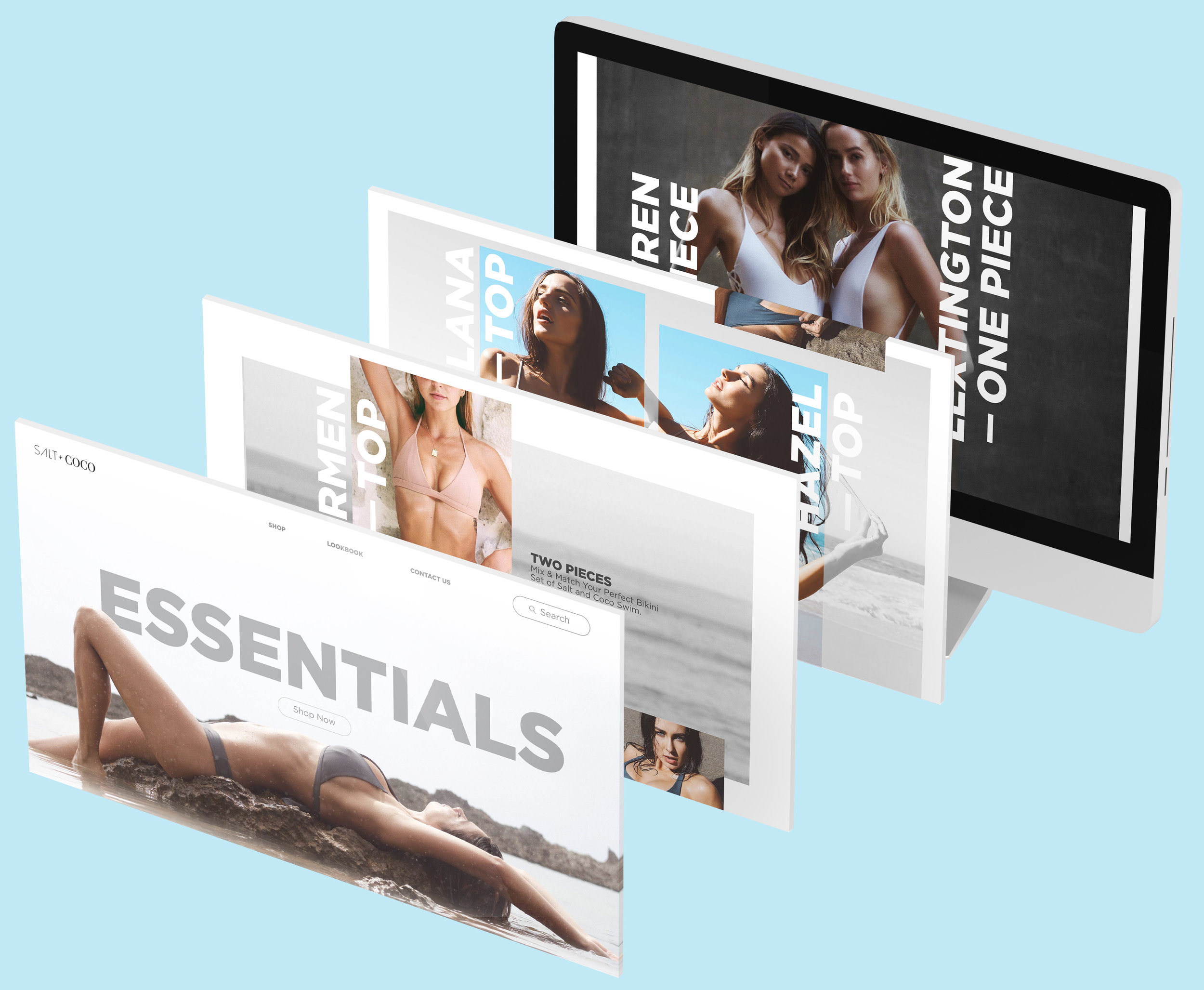
Salt & Coco | Website Design
Case Study
Overview
Salt & Coco is more than just a swimwear brand—it’s a lifestyle. Their designs, inspired by nature and the modern on-the-go individual, exude versatility and elegance.
From carefree ocean dips to chic nighttime gatherings, every piece balances form and function.
The website redesign aimed to mirror this ethos, delivering a user experience that feels as seamless as their swimwear looks.
Objective
We sought to create an experience that felt intuitive, welcoming, and reflective of Salt & Coco’s values.
This meant stripping away the clutter and making every interaction purposeful.
Customers needed to effortlessly browse, shop, and engage with the brand, all while experiencing the elegance of the Salt & Coco world.
The Problem
Key Issues Identified:
Cluttered Navigation:
Users often described the experience as "overwhelming" when trying to locate specific items.
Inefficient Checkout Process:
A multi-step checkout discouraged repeat customers. "It felt like jumping through hoops to buy something," noted another shopper.
Lack of Personalization:
The website felt generic. Shoppers missed features like tailored recommendations that align with their taste and lifestyle.
Inconsistent Branding:
The previous design lacked the elegance and minimalism synonymous with the swimsuits. The disconnect left users questioning the brand’s premium quality.
Insights from Research:
Through user interviews, analytics deep-dives, and competitor analysis, we uncovered actionable insights:
Nearly 60% of visitors abandoned the website within seconds, citing frustration with navigation.
Users hesitated to purchase due to insufficient size guidance and unclear product details.
Brands like Summersalt and Everlane thrived on personalized experiences, setting a higher bar for expectations.
The Solution
Design Goals:
Build an intuitive navigation system that feels second nature.
Optimize the checkout process for simplicity and speed.
Bring personalization to the forefront to delight every shopper.
Align every pixel with Salt & Coco’s minimalistic, nature-inspired branding.
Design Process
Research
We started by understanding the soul of Salt & Coco through:
User Personas:
Meet Sasha, the "Casual Explorer," who browses for inspiration, and Ana, the "Efficiency Seeker," who values quick, purposeful shopping.
Competitor Benchmarking:
Summersalt’s smart categorization and Everlane’s seamless storytelling gave us ideas to elevate our approach.
Usability Testing:
A beta group walked us through their pain points, helping us spot gaps in clarity and flow.
Wireframes
Low-fidelity sketches allowed for quick iteration.
Through multiple testing sessions, we refined:
Homepage Hero Section:
Eye-catching visuals paired with concise messaging like "Sustainability Meets Style."
Product Pages:
Amplified focus on imagery and interactive size tools to boost confidence.
Ideation
Key Features:
Streamlined Navigation Bar:
Clear swimwear categories "Bikinis," "One-Pieces," "Accessories"
each with dropdown subcategories.
Smart Size Finder:
An interactive quiz helping users find their perfect fit in under 2 minutes.
Tailored Suggestions:
A "Complete the Look" section paired items like tops and bottoms seamlessly.
Progressive Checkout:
One-click payment options and a visible progress tracker to reduce friction.
High-Fidelity Designs
Our final designs infused Salt & Coco’s identity:
A calming palette of soft beige, oceanic aqua, and coral accents.
Typography that balanced legibility with sophistication, echoing the product’s timeless appeal.
Rich imagery celebrating diversity, sustainability, and adventure.
Implementation
Key Pages:
Homepage:
Dynamic collections like "Eco Essentials" and "Ocean to Evening" captivate users.
Product Listing Page:
Filters by color, size, and activity type simplify decisions.
Product Detail Page:
From 360° views to user reviews, every detail inspires trust.
Checkout Flow:
One-click payment options—because every second counts.
Results
Conversion Rate Surge:
Checkouts increased by 25% as users found it easier to complete purchases.
Bounce Rate Drop:
Improved navigation kept 40% more visitors engaged.
Stronger Engagement:
Shoppers spent an average of 3 minutes longer exploring collections.
Learnings
Challenges:
Marrying simplicity with robust functionality took multiple iterations.
Ensuring technical feasibility while staying true to the brand’s ethos required close collaboration.
Successes:
The design resonated with users—"It just feels like Salt & Coco," shared Chloe, one of our testers.
Personalization features were particularly loved, leading to higher satisfaction scores.
Conclusion
This website redesign isn’t just about functionality; it’s about storytelling. Every element—from the layout to the colors—carries the brand’s ethos. Users now experience a seamless blend of inspiration and practicality, making Salt & Coco more than a shopping destination; it’s a digital reflection of the lifestyle it champions.
Credits
UX & Ui: Leo Ventura
Photographer: Pauline Le


